
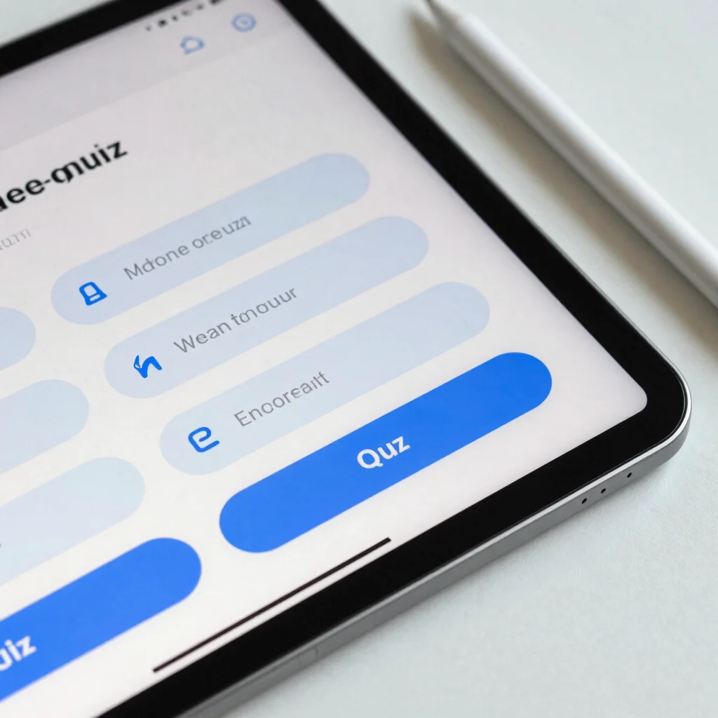
Accessibility in corporate e-learning is frequently treated as a final compliance audit rather than an architecture decision. By embedding visual focus indicators and high-contrast color tokens into your primary template system, you deliver inclusive interactions without sacrificing modern visual precision.
Establishing Contrast Ratios Without Muting Brand Identity
Achieving WCAG AAA compliance does not require flat, uninspired slide designs. Utilizing cool slate gray backgrounds with targeted frost blue accents allows critical action items and interactive hot spots to stand out clearly while maintaining an elegant, muted background matrix.
Designing Focus States for Screen Reader Compatibility
Tab key navigation relies on predictable spatial sequencing and high-visibility focus borders around buttons and cards. Custom slide templates should feature dedicated offset outlines on all click targets, giving learners clear visual feedback as they navigate structured content blocks.
Streamlining Feedback Layers for Knowledge Checks
Immediate feedback in quiz slides needs distinct structural containers so learners instantly distinguish correct explanations from remediation steps. Standardizing slide overlays with consistent typography and iconography reduces cognitive load and keeps the focus entirely on learning retention.
Leave a Reply